KRISTEN OBEID WEEK 1-10 BENV1010 BLOG
KRISTEN OBEID'S BENV1010 - BLOG
ENTRY 1: WEEK 1 - 18th February 2020
ONSITE: Site Documentation, sketching, and photography -
INFORMATION ABOUT THE DESIGNATED SITE
What buildings or structures are on the site?
How many? One building
How big are they? It is a large apartment complex.
Where do we get into the buildings? There are designated entry points from the steps which is located at the foyer of the building.
What other openings are there (for example, windows)?
- There are windows located on either side of the building.
- There are panels of glass from the top of the bottom to the building displayed on either side of the entry.
- The entry to the building can be accessed from the steps at the bottom of the base foyer.
Are they multilevel? (if so, how do we get from one to the other?) The apartment complex is multilayered. The different levels can be accessed via lift as well as staircases, installed foe fire safety reasons.
What natural elements are on the site?
Trees, shrubs, waterways, rocks.
Trees, shrubs, waterways, rocks.
The site is composed of majority of solid materials e.g. Concrete, steel, pavers etc. Although the concrete planter boxes contain shrubs which add to the landscape of the building.
- Opposite the building there is an opening of grass which contains trees and natural rocks and bark products.
Material Elements found on site
What are the manmade elements composed of? e.g. Brick, Steel, Glass, Sandstone etc.
The building is composed of:
Concrete slabs, steel, timber, aluminum pavers, light fittings
How do people use the site?
Is there a thoroughfare? People use the site for accommodation purposes. Therefore, there is a consistent thoroughfare throughout the day. Also close to the apartments is a walkway which students’ access after departing from a nearby bus stop. Thus, increasing the thoroughfare within the area.
Is there a contemplative space?
What are the different intended or unintended functions of the site? The intended purpose of the site is to inhabit students, provide them with a residence. The unintended purpose of the site may be that it is used as a meeting space or a sitting area. Opposite the building is a grass area which may be used by students to sit on.
What is the orientation of the site?
Where is North, South, East, and West? North East
(Out of Class Activity) Where is the Sun at 3 different times in one day (morning, midday, and afternoon) - the sun hits from the left side in the morning, then moves towards the right side of the building throughout the day.
Photography: Taking photos of the site -
STUDIO: Getting to know your tool kits and different types of mark-making -
ENTRY 2: WEEK 2 - 25th February 2020
ONSITE: Today onsite each group was required to find examples of a series of design elements, principles, and components that are apparently common within the Built Environment.
Below are my images captured from my designated group space.
Lines: This image portrays linear flow and distinct lines.
Shapes (geometric or organic): This image distinguishes geometric shapes.
Direction (of lines): The timber panels are horizontally organised which indirectly elongates the image.
Size/ Scale: Size and scale are represented in the image, by comparing the size of the retaining wall to the metal window shielding as-well-as the wooden framing used.
Texture: In this image, texture can be identified contrasting the properties of the green foliage with the metal and wooden finishes, as well as the concrete planter bed.
Colour: Subtle use of the color orange is used in this image to contrast the harsh use of greyscale properties on the building. The use of the timber and black window shield adds to the aesthetic finish of the symmetrical design of the entire structure.
Balance: Balance is identified in this image comparing the different heights and scales of the three buildings captured in the image. Not only the sizes of the buildings are balanced, but also the materials and textures are balanced in order to make sure space flows harmoniously.
Proximity: The steps form seamlessly to the opening of the building leading to the foyer entrance.
Alignment: The foundation of the steps, the railings, and the textured safety tiles form seamlessly with the width of the door.

Contrast: The lighter concrete on the top of the building can be contrasted with the painted grey along the bottom of the building.
Space: The opening space in the foyer area is particularly empty and serves as a point of access to the opening of the building.

Additionally, we were then required to find at least 20 examples of Built Environment specific words.
 Safety Element
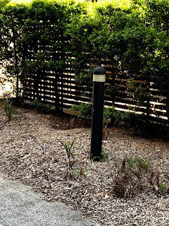 Street Furniture
 Pathway
 Edges in the Landscaping
 Balustrade
 Way Finding (Signage)
 Lighting
 Retaining wall
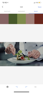
Some swatches from the designs elements, principles and components that I found within my designated site:


IN STUDIO: I chose to communicate the information represented in the food category data set. The reason I selected this category is because I'm a foody and enjoy experiencing new cuisines.
The three words I used to describe the data set were:
CULINARY
NUTRITION
LONGEVITY
Therefore, the colours and words associated in these images indicate that the types of tones and hues I use in my infographic will range from a variation of light greens, yellows, browns and blues.
Individual Data Visualisation:
Group Data Visualisations:
ENTRY 3: WEEK 3 - 3rd March 2020
ONSITE: Measuring the site and recording it using graph paper and a pencil:
Individual orthographic drawing:
Group Orthographic drawings:
ENTRY 4: WEEK 4 - 10th March 2020
In studio today the group finalised all components of the assessment. We decided upon elements we would use for our final collated image to represent our growth and development over the 4 weeks.
This was the final image:
ENTRY 5: WEEK 5 - 17th March 2020
Model Making Activities: Studio Activities
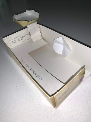
1) Measure the space’s heights and widths and identify the floor ceilings, walls, doors, and windows. Make a template on flat paper, leaving a tab on the edges and then fold them together to make an enclosed form.
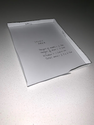

In the above images, I realised I had not created the model at the right scale. Therefore, The images below are the model created at the correct scale.
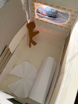
2) Once you have made this in paper material, make the shape in cardboard
3) Creating a better version of my room
Model Making Activities: Studio Activities
1) Measure the space’s heights and widths and identify the floor ceilings, walls, doors, and windows. Make a template on flat paper, leaving a tab on the edges and then fold them together to make an enclosed form.


In the above images, I realised I had not created the model at the right scale. Therefore, The images below are the model created at the correct scale.
2) Once you have made this in paper material, make the shape in cardboard
Compare what it is like to work with the two different materials. Which is easier to work with:
Both materials present different capabilities. Paper is easier to communicate direct measurements, although the cardboard is better in expressing 3D elements and aspects. Personally, the cardboard is an easier material to work with because I'm able to grasp the dimension and area of the space I'm designing better. Being able to see something visually and in real form, communicates a clearer message from my perspective.
3) Creating a better version of my room
My final room design incorporates a fort, above the window which adds another layer to the initial design of the room. Additionally the V pleated circle in the centre of the room is a vault - when turned the vault sinks to the ground and underneath lies another room space. Obviously, these ideas are quite farfetched although if money did not matter I would want the space to feel unorthodox in the way it is set and the dimensions it encompasses.
Inspired by a transition space (hallway, lobby, stairwell, etc) in your house, apartment or building create your own version of Russell's demonstration model using 3 rectangular prisms. When laid out flat the components should all fit within a 400x120mm rectangle; this will determine the overall size of each element.
I started off by drawing a sketch of the transition space I was going to model. The space I modelled was my hallway area which attaches directly to the original study room I modelled above.
I then proceeded to sketch in Fusion 360 following the steps of Russell. Below is an example of one of the faces I had to create (floor).
Measuring and scaling were involved in the process to ensure that the components of the final product would fit on the illustrator template for the process of laser cutting.
Fusion 360 served up some hurdles in terms of operating the system and reaching the ideal design I was trying to communicate.
Fusion 360 served up some hurdles in terms of operating the system and reaching the ideal design I was trying to communicate.
Below is the final rectangular prism in the 3D form before I had to separate the components to align on the template.
Below is the Illustrator file, I had to download the template and make sure that the layers and corresponding colors all aligned in the right layer to ensure that during the laser cutting process everything would be cut accordingly and precisely.
See submission 3 for AI format:
ENTRY 6: WEEK 7 - 31st March 2020
Studio Activities:
Model 1: Iterative Model with an additional source of natural light at a new scale
I chose a new scale at 1:20, for the reason that it was more conventional to design at. I chose to use only cardboard for this design. Personally I find it better to work with cardboard as it it more durable and conveys dimension and aspect better than paper.
The body (walls) were simple to cut as they were all rectangular shapes. Additionally I added the wrap around desk.
The V pleat technique was used to create the stairs to the fort above the window. Then the object at the top of the stairs is a seat. The seat was made first by cutting a rectangular shape, then cutting in the edges and joining to create an elevated oval seat.
The window was left open, as it is the only source of light which enters the space.
These images below captured in normal room light (sunlight):
Model 2: Fusion 360 Model in Paper
Using below the tongue and fold technique, I made an identical model of the three rectangular prism faces I initially created in Fusion 360.
This transitional space coveys the door way out of my study and into the main hallway area.
Online Tutorial Week 7: Fusion 360 3D Shapes
For this task, you'll take the initials of your name and create a small curvilinear object using the loft and shell features in Fusion 360.
This task was interesting as it allowed me to gain a deeper understanding of curvilinear objects and their effect within the design process. The abstract element of this shape is intriguing to view from different angles.
Model 1: Iterative Model with an additional source of natural light at a new scale
I chose a new scale at 1:20, for the reason that it was more conventional to design at. I chose to use only cardboard for this design. Personally I find it better to work with cardboard as it it more durable and conveys dimension and aspect better than paper.
The body (walls) were simple to cut as they were all rectangular shapes. Additionally I added the wrap around desk.
The V pleat technique was used to create the stairs to the fort above the window. Then the object at the top of the stairs is a seat. The seat was made first by cutting a rectangular shape, then cutting in the edges and joining to create an elevated oval seat.
These images below captured in normal room light (sunlight):
Include Human Figures to Indicate Scale as well as using light to shine through models:
By using light and human figures it added a real-life effect to the models. In the sense of shadows and light cavities.
For the models below I used a warm lamp, with the intention of the lamps light to resemble a late afternoon sunset. I believe these images below are effective in communicating both scale and light, setting a scene for a viewer.
Another model with a normal phone torch light. I don't believe it conveyed scale and light like the first model did.
Model 2: Fusion 360 Model in Paper
Using below the tongue and fold technique, I made an identical model of the three rectangular prism faces I initially created in Fusion 360.
This transitional space coveys the door way out of my study and into the main hallway area.
Below is the 3D model. The first image being the birds-eye view. The walkway from the study starting from the left of the image (smaller rectangular prism) and the longer rectangular prism representing the hallway.
For this task, you'll take the initials of your name and create a small curvilinear object using the loft and shell features in Fusion 360.
This task was interesting as it allowed me to gain a deeper understanding of curvilinear objects and their effect within the design process. The abstract element of this shape is intriguing to view from different angles.
Kristen Mary Obeid (KMO)
ENTRY 7: WEEK 8 - 7th April 2020
Studio Activities:
This week’s studio activities focus on the visual representation of materials in drawings and in 3D models.
Deliverables: 3 x photoshopped photos of one of your models, (each with different material combinations) composited into any virtual environment of your choosing.
Deliverables: 3 x photoshopped photos of one of your models, (each with different material combinations) composited into any virtual environment of your choosing.
I choose to photoshop the model I made in resemblance to the 3D model I created of my transition space on Fusion 360 as it had flat surfaces and would be easier to manipulate in Photoshop.
I made the background transparent on the image of the model so I would be able to manipulate it within the new natural environment I was going to place it in.
Below were the three photoshopped photos of the one model with different material properties in the same natural environment.
I chose a greenspace background as green spaces always remind me of the connection to the natural world. Additionally, the trees in the image help to communicate scale.
Aside from blue being one of my favourite colors. I chose to use the mosaic blue tiles as the material application in this image as it reminds me of my love for the water as I was a swimmer growing up. The reflection of the water reflecting off the different hues of blue adds an interesting element to the final image.
Furthermore, I chose to use this sand material in this specific color as it reminds me of The Rainbow Mountains of Peru. Thus, the use of this material reflects my aspiration not only to visit Peru but also my love for travel - immersing in the culture of different communities internationally.
Conclusively, the grass material applied is reflective of my love of the natural environment. Both the flora and fauna aspects of the greater environment. I believe this is an interesting combination with the existing background on this image. I can see how the building clashes with the surrounds - due to colors being too similar, etc.
Create three material combinations on the 3D Fusion model of your initials. It's up to you what materials you choose and how many materials you apply, but they should reflect your personality or interests in some way and you'll communicate this in writing on your blog.
Below is the model of my initials with 3 applied backgrounds:
1. Chrome Blue - Blue is the universal color that represents a love for education. This color resembles my passion for continuously willing to further my knowledge in all aspects of life. I believe learning either theoretically or practically is an investment to yourself individually and will never fail you.
2. Glossy Leather - The glossy leather reflects my love for fashion and design. I enjoy shopping and styling. It has brought me much happiness over the years.
3. Pink Glass - The pink glass was used not only to add light to the overall design because the other material properties chosen were quite dark. But it also represents my personality. Sometimes you are faced with challenges in life which may cause you to feel fractured or setback. To overcome these challenges you must overcome your setbacks and focus on the next task you aim to achieve. Thus, the relationship to the glass is, when the glass gets smudged you wipe it and the surface becomes shiny again. I have been faced with many challenges in my life, but I've always found ways to see the brighter side of situations.
Below are the Fusion 360 Captures of my rendered initials:
Below are the Fusion 360 Captures of my rendered initials:
ENTRY 8: WEEK 9 - 14th April 2020
The statement will introduce the title of your project, the intent of your communication approach and then explain how you accomplished your objectives using an example of one of your projects. Use the “Expository Writing” format:
Lighting Influences the Perception of Space
Lighting within design attributes to the way individuals perceive spaces they occupy.
Light is used to position figures within space. Architect, Etianne-Louis Boullé states, “the art of touching with the effects of light belongs to architecture”
A warm light was used in the model to portray the inviting atmosphere of the room.
Additionally, the room is intended as a functional workspace, thus the figure being the main focal point, solely to humanise the overall environment. The lighting predominantly shines upon the figure which reinstates the realistic objective of the space. The use of light in the model influenced a perception of space.
[1]Inverse Architecture n.d, The Importance of Lighting in Architecture, accessed 23rd April 2020, <https://inversearchitecture.co/2016/10/26/the-importance-of-lighting-in-architecture/>
ENTRY 9: WEEK 10 - 21st April 2020
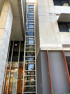
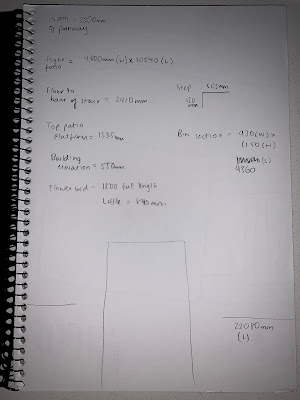
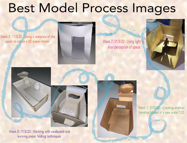
Final curated blog submission documenting best 10 technological and model process images from week 5 onwards:

















Comments
Post a Comment